The Modular Web Page
by Peter Lavin
Originally published at DevArticles
Overview
A modular approach to page design can save time in developing and maintaining a web site. A page template may be created and the different components of the page plugged in where appropriate. No tools other than a text editor are required. This will involve "including" files within one another. Since this necessitates server-side processing some kind of server will be required. To test the code presented here we will be using a PHP enabled server. This can be done quite readily if you are using Apache web server with a Linux distribution. If you are running Windows and Personal Web Server or Internet Information Server you will need to ensure that they are PHP enabled.
Introduction
This article will take a modular approach to creating web pages. It is often the case that all pages on a web site incorporate some identical features. The top, the sidebar and the bottom of a page might be identical throughout a site. Only the content in the centre of the page changes. If a site has multiple pages and each one of them has the same graphic at the top, the same links in a sidebar and likewise with copyright and site information at the bottom it makes sense to create a template that can be repeated. Why cut and paste many times when you don’t need to? Even more importantly, you greatly simplify the maintenance of your web pages. If one of your links changes you only need to update it in one place. As noted above the ability to include files will require some kind of server-side technology. We will be using PHP but you could as easily use ASP or Server Side Includes. However, you will have to change the syntax and file names accordingly.
Designing Your Page Layout
We first need a plan of what our page will look like. In this case we will create a "typical" web page with a top, a sidebar a central area and a page bottom. Using a table is a very effective way of achieving this. Find below a graphic of the kind of page I mean:
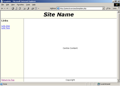
Setting the border attribute of the "table" tag to "1" is an excellent idea at this stage of development. Having the border visible gives us a clear idea of the layout of our table. Of course, when we’ve finished our page we will likely want to hide the border by setting the value to "0".
In the example above, you can see that we have a table of three rows and each row has either one or two columns. The first row spans two columns and stretches across the top of the browser. The first column of our second row is the sidebar while the second column of this row is reserved for the changing content presented in the centre of the page. Finally, our last row contains a link to the top of the page and copyright information.
You can see that the table is a powerful tool for controlling the position of elements on a web page. The effort spent on learning to manipulate a table’s attributes is well repaid. Some people will argue that the "div" tag in conjunction with a Cascading Style Sheet (CSS) offers a superior method of control.
I’m not so sure myself but enough of that. Let’s see what the code looks like.
The Code
First a look at the "skeleton" of the page. This is our template file. Its name will change with the content at the centre of our page. For instance, if this was a welcome page we would put in appropriate content and save the page as "welcome.php".
template.php
<!DOCTYPE html PUBLIC "-//W3C//DTD XHTML 1.0 transitional//EN"
"http://www.w3.org/TR/xhtml1/DTD/xhtml1-transitional.dtd">
<html>
<head>
<title>Template</title>
<meta name="description" content="" />
<meta name="keywords" content="" />
<meta http-equiv="Content-Type" content="text/html; charset=ISO-8859-1" />
<meta name="author" content="Peter Lavin" />
<link rel="stylesheet" type="text/css" href="style/template.css" title="template" />
<!--local style elements here-->
<style type="text/css">
</style>
</head>
<body style="margin: 0px;">
<a id="top"></a>
<table cellpadding="5" cellspacing="0" border="1">
<tr>
<!--insert column here -->
<?php include 'top.inc'; ?>
</tr>
<tr>
<!--insert column here -->
<?php include 'sidebar.inc'; ?>
<!--setting width to 100% here forces most browsers to fill screen -->
<td class="main" width="100%" align="center">
<font="16pt">Centre Content</font>
</td>
</tr>
<tr>
<!--insert columns here -->
<? include 'bottom.inc' ?>
</tr>
</table>
</body>
</html>
The page contents are exactly what we might expect from the picture above. The entire page is enclosed in a table and there are three separate include files. There are comments to identify the location and the type of inclusion. It is best to make your inclusion a self-contained element. For instance, if you are including a complete column start your include file with the "<td>" tag and end it with the "</td>" tag. Doing this will make your code easier to understand.
A brief note about how our template page displays in different browsers would be in order. As is often the case, not all browsers render this page exactly as pictured in our image above. However, once content has been entered in the centre panel both major browsers show a virtually identical version of this page.
You may notice that some of the HTML tags are not exactly familiar. This page has been created to be XHTML compliant. This is a good habit to get into especially if you plan to go on and learn XML. To find out more about XHTML check out the tutorial offered on the W3C site. This is the World Wide Web Consortium site and if you are not already familiar with it have a good look around. There’s lots to be learned there and many useful resources.
top.inc
The code here is pretty simple. We want our first column to span the width of the browser and since our table has only a maximum of two columns the "colspan" attribute is set to "2". The "class" attribute is not strictly necessary but by including it the presentation of our page can be made more flexible. We can quickly reference this particular "td" tag from our style sheet. Setting or changing the style attributes from one central location makes designing and maintenance much easier.
<!--one column spanning the browser window -->
<td class="top" align="center" colspan ="2" height="80px">
<p style="font-size:26pt;">
<i><b>Site Name</b></i>
</p>
</td>
For the sake of showing something we’ve put some text in this column but it might more typically be a graphic. Notice also that this "top.php" file is made up of one complete column – a set of open and close table data tags - inserted between the open and close tags for a table row. Document your code with internal comments. Web pages can grow into large and unwieldy things. You may think you understand your page thoroughly as you are creating it but try coming back to it after a few days off. You’ll wish you had even more comments.
sidebar.inc
<!--a column containing links -->
<td class="sidebar" valign="top" width="20%">
<p class="head">Links</p>
<a href="page1.html">Link One</a><br />
<a href="page2.html">Link Two</a><br />
<br />
<br />
</td>
Very similar to our "top.php" file. We want our sidebar to occupy twenty percent of the page so have set the width to this value. The advantages of using include files are most evident here. To change the links in any page that includes this file we change it in one and only one place.
bottom.inc
<td class="sidebar"> <a href="#top">Return to Top</a>
</td>
<td class="main "align="center" colspan = "2">
Copyright
</td>
By now I’m sure you’ve pretty much got the idea but a few comments on this include file are in order. This final file differs in that it contains two columns. We want the first column to contain a hyperlink to the top of the page and we want this hyperlink to always appear at the very bottom of the page. Creating a column in the final row allows us to do this. This column will "inherit" the width of the sidebar column above so its width will be identical to the sidebar. We want it to appear seamlessly as part of the sidebar so this is a desirable effect. We also want it to have the same display characteristics as the sidebar so we have given it the same class name. Because of this, changes to the sidebar class in the CSS file will effect the entire left side of our page. For the moment, the border of this cell is visible but remember we will be removing it when the page is complete.
Similar arguments apply to our last column. Hence its class name.
Conclusion
It is always easier to learn first from relatively simple examples and I hope that is what we have presented here. I’m sure you can readily see how we might apply the same principles to a more complex page. For instance, with not many adjustments, a right sidebar could be added to our template. Likewise, the content at the centre of the page could be contained within a table that is itself an include file. Things can get very messy and very complicated quickly but if you have a clear plan in mind and build things up piece by piece they can be kept manageable.
We have shown how include files can make page design and maintenance much easier. Where to go from here? Dynamically created include files - but that is the subject for another article.
About the Author
Peter Lavin runs a Web Design/Development firm in Toronto, Canada. He has been published in a number of magazines and online sites, including UnixReview.com, php|architect and International PHP Magazine. He is a contributor to the recently published O'Reilly book, PHP Hacks and is also the author of Object Oriented PHP, published by No Starch Press.
Please do not reproduce this article in whole or part, in any form, without obtaining written permission.